

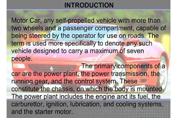
What makes a good presentation? Let’s look at Hans Rosling’s presentation on Statistics as an example. In this video, he is delivering a Ted Talk about statistics and child mortality- a topic that may not be the most engaging by title alone. As you begin to watch, the most impressive element of this presentation quickly becomes obvious – his endearing enthusiasm. However, there are also other factors that make this a great presentation: the design and layout of his slides. The slides have little text and are mostly used to guide his dialogue.
To highlight this impressive presentation, we can look at this article by PC World called, “Top 10 Worst Powerpoint Presentation Presentations”, which contrasts against Rosling’s simplified slides:
 https://www.idgcdn.com.au/article/images/750×750/dimg/m_img_34393.jpg
There are many reasons why this slide is considered one of the worst, but in general, it’s simply too busy to extract any meaningful information from it. When creating slides for lessons, we need slides to be strategically designed so that students can quickly find important information with ease. In order to do that, we can apply some simple rules:
Font volume & size
- How much text is too much? How much is too little? In order to answer these questions, we are going to apply a few of Rich Mayer’s 12 principles of “cognitive theory of multimedia learning”.
- The signaling principle: If presenting a slide with lots of information, individuals need guidance as to what to direct their attention to.
- Sometimes slides need to have more text than others. This principle suggests teachers guide students through the text while they present. This will also help students not to feel overwhelmed with too much information.
- The modality principle: Try to limit text use to printed instructions, lists, references, and resources for non-native English speakers. Students learn best through narration and graphics.
- This principle suggests the teacher use text only for lists, references, and resources for non-native English speakers.
- The signaling principle: If presenting a slide with lots of information, individuals need guidance as to what to direct their attention to.
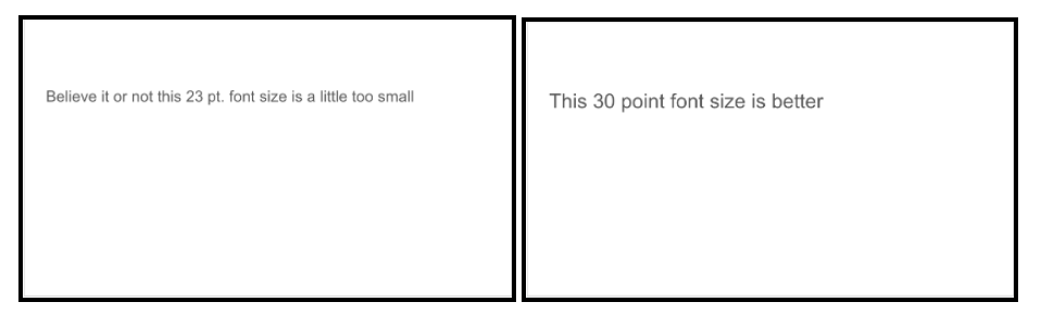
- Regarding font size, the general use is to not use a font size that is less than 24 points. Choose one that ranges from 28 pt to 32 pt.
Color use
If you choose to use the power of color to supplement your presentation, apply these basic color tips:
- Use high-contrast text-to-background combinations
- Use dark text on a light background.
- Using text with an outline contrasts well with any background.
- Consider split complementary colors.
- This is particularly useful if you are planning to use a color scheme for your presentations. It involves selecting a primary color and using two analogous colors to its complement. For example, if we wanted to add some color to our current black and white presentation, I would begin by choosing the primary color green. The complement of green is red – but I wouldn’t choose red, I would choose analog to red. So in this case, my scheme would be green, purple, and orange.
Source: (Durso et al. 2011)
Durso, F., Pop, V., Vurnett, J. and Stearman, E., 2011. Evidence-Based Human Factors Guidelines for PowerPoint Presentations. Human Factors and Ergonomics Society,,.
In general, if you choose to use color to highlight important information – do not overuse this highlight color. Once you use it once, students will begin to associate the color with important, testable material. Therefore, only use it for important material.
Multimedia Integration
The most important aspect of integrating multimedia into your presentation isn’t which content you select or even how it looks in your slides; it’s your content’s accessibility. You need to remember that after presenting your slides during your lecture, your slides don’t necessarily get archived and forgotten. If you intend on posting your slides online (which I strongly suggest you do), you need to make sure that the multimedia in your slides is accessible.
Three criteria you should consider for making your content accessible are:
Is your content available?
- Are the pictures and video you’ve included in your slides actually part of the presentation or are they linked from your personal computer?
- Do the hyperlinks you’ve included actually work?
- Are you linking videos that exist behind paywalls?
Are your slides compact?
It’s likely that you’ll be posting your slides on your school’s LMS or an app like Google Classroom and that every time a student accesses your slides they may need to download it. If your presentation includes several videos embedded in it then it may take a long time to download. This inconvenience is a barrier for your students’ learning and they may decide not to bother going over the slides again.
Some ideas to make your presentation more compact:
- Consider posting videos to YouTube or some other video sharing platform, and providing the link in your slides.
- Avoid using pictures with unnecessarily high resolution (if it’s necessary for your lecture, use high-resolution photos, but replace them with compressed versions before posting it to your LMS).
- If your presentation is too long, consider breaking it down into smaller topics and label them clearly.
Are your slides accessible?
Something that usually gets lost when creating resources for students is accessibility: is your content appropriate and readable for students with varying physical and cognitive abilities? An excellent resource for what technical factors can help you make your content more accessible can be found on UVic’s Accessibility Guidelines.
It’s a good idea to keep these criteria and suggestions in mind when creating your slides but you should always check after posting that your content is accessible. A good way to do this is to try to access your slides from a computer that you didn’t use to create it (ie. a library computer). From there, you can check if all of your multimedia is present in your slides and how long it takes to download the file.
A final note on accessibility: all LMS’s are different and your slides should be optimized to look good on your organization’s LMS. For example, UVic uses Brightspace; if you post your slides on that platform, you should open them through Brightspace and check that they’re readable.

3 Popular Presentation Platforms: A Quick Review of their Advantages and Disadvantages
Below I’ve compared three of the top slide presentation platforms in use today. Microsoft PowerPoint is easily the most well-known and widely used presentation platforms, and has been for over 30 years! Because of this lengthy history, it is the standard presentation platform, which all others since are generally compared with. Google Slides was technically released in 2006, but was substantially upgraded in 2016, along with the other members of the Google suite, and has since become an increasingly popular choice for online collaboration. Prezi is the third platform reviewed and is the youngest of the three, having been released in 2009. This software challenges the traditional presentation frameworks that Microsoft and Google have clung to and offers instead an innovative design that has continued to stand out among the ever-growing list of presentation platforms.
Advantages
Microsoft has made a limited version of PowerPoint available for free, for iOS and Android. As the standard in Presentation software, it provides all of the features you’d expect to be able to make your slideshow as integrated with multimedia as you’d like it to be. One highlight is that PowerPoint is fairly user-friendly, which is likely due to the large population it serves and the extensive history it’s been available for Microsoft to refine it. The additional similarities of the interface design to that of Microsoft Word, which many are already likely familiar with, makes much of the fine-tuning of slides quite intuitive. There is an extensive and ever-expanding list of great add-ons available to help keep your presentations looking fresh. It is extremely easy to rearrange the order of slides and create simple, but effective transitions. PowerPoint has become a contender in the online collaborative world, and its function to allow groups to create and edit slides is now comparable to what is offered by Google Slides. One of the major advantages of course is that Microsoft PowerPoint comes ready to use on many computers, and doesn’t have to be sought out, like Prezi or Google Slides. It also can be run without an internet connection, so there are no worries around how to present if issues arise with the wifi.
Disadvantages
As this has been the standard of presentation platforms for a while now, there aren’t many disadvantages to sticking with PowerPoint, but I’ll highlight a few that may be helpful to consider. The first and biggest disadvantage is what you’re choosing to not use by choosing PowerPoint. There is an ever-increasing array of platforms and sites that are changing the way that slideshows have been traditionally presented in the past. Though PowerPoint is constantly updated to incorporate some of these modernizations, it has a lot of old baggage that its user base may not let them change so easily. New platforms have not such baggage and offer many fresh looks and features that may not be even compatible with PowerPoint’s design. By using it, you might end up making “just another PowerPoint”, and if your goal is to relay anything important to your audience, you may want to consider grabbing their attention with something they haven’t seen ad nauseam. Lastly, if you are a mac user, you will not have had this program installed on your computer when you bought it and will, therefore, need to buy it and it, unfortunately, comes as part of a bundle which can be bought for $79/year.
Advantages
Google Slides is a part of Google Drive’s office suite and has been a leader in enabling collaborative presentations. This platform exists online and is, consequently, has the advantage that your presentations are always backed up. There is also the option of downloading your presentations as PowerPoint files and, vise versa, PowerPoint files can be converted into Google Slides. If you don’t want to convert them to PowerPoint, but still want to access your presentations offline, then the Google Slides app is what you’re looking for. This app allows for offline presenting and automatically syncs up with any modifications you’ve made to the online file once you’re re-connected to the internet. Similar to PowerPoint, the range of add-ons available is extensive and will allow you to continuously improve the quality of your presentations, keeping your audience engaged and hopefully impressed. The greatest advantages, however, are likely the facts that Google Slides is free, doesn’t take up any space on your computer, and can be accessed from any internet browser on any computer. All of these advantages together are quite substantial and help to remove a significant amount of stress around presenting.
Disadvantages
The online nature of Google Slides is mostly positive, but there are a few small concerns related to this. If you don’t have your presentations downloaded or accessible from the Google Slides app, then you are at the mercy of the local internet Gods, which may be too risky for some. So, if your planning for a serious presentation, it is recommended to have one of these fallbacks. Even still, converting a Google Slides presentation to a PowerPoint file or pdf carries the risk of formatting issues and even incompatibility problems with your content, and is something to keep in mind if you have to do a last-minute conversion. Lastly, there is a more subtle disadvantage that you should be aware of. Because Google slides is all online and hosted by Google for free, they do indeed have the ability through AI scanning technology to know what content you’ve created, for the intents of the understanding you better (likely, not just for the benign sake of curiosity). This is likely more relating to Google Docs, as that’s where people tend to store the bulk of their information, and is where people have reported Google removing their documents (due to supposed copyright infringements), but this is still something to consider.

Advantages
Example of Prezi presentation progression.
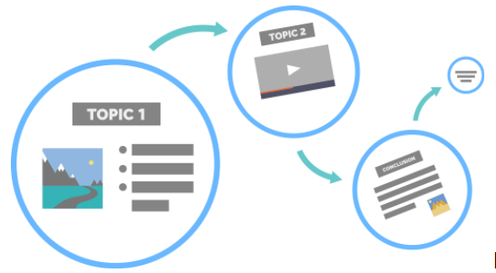
There are a number of powerful advantages that Prezi has to offer over other slide platforms. The most noticeable of these features is the incredible movement that comes built into the presentation templates. Prezi states that this has the effect of creating a “Conversational Presentation”. The way it works is that one home slide can hold modifiable topics that have subtopics within them, which can be zoomed into and out of. As one zooms in to one of these subtopics, the screen seamlessly transitions to the new slide, revealing subtopics with their own pages and transitions. This movement that occurs from the big idea to the subtopics creates an amazingly engaging presentation that will surely impress your audience. One major advantage to the design of the presentations is the versatility that’s created. Unlike regular slideshows that have a clear beginning and end, Prezi allows you to decide what topics or subtopics to move to next and creates as a result, a more personalized presentation that strengthens the connection between the audience and the presenter. This is what they mean when they say it is a “Conversational Presentation”. Lastly, the interactive features that are offered also allow for an impressive range of modifications and flexibility that will open up ways of presenting that you’ve likely never considered. Even the limited free version has enough to turn the most basic presentation into something people will talk about.
Disadvantages
A number of disadvantages are encountered when you first start using Prezi. To begin with, the free version is quite limited in the availability of templates and features, and it might make sense if you’re planning on going all out on your presentation to opt for the $15/month, Plus version, or if you’re a business professional, maybe the $59/month Premium version. Either way, you get what you pay for with Prezi and Free won’t get you much. One disadvantage is related to the motion that these slides are known for. Specifically, there have been reports of issues around glitchy presentations. So, if your computer or internet connection isn’t powerful enough to manage the graphics, then maybe this isn’t the right platform for you. On a related note, Prezi requires an internet connection to present, which may be a disadvantage, depending on where you’ll be presenting.
One important thing to consider is if Prezi is right for your presentation at all! It’s maybe not so clear from the outset, but the interactive nature of this platform may actually make a presentation feel less fluid or worse, appear less understandable for the audience when compared to simpler presentation styles. Many of the common reviews of Prezi mention that it is a bit more difficult for a beginner to navigate and create slides from scratch. I found this to be true; however, I only consider this to be growing pains that are bound to occur with any new platform. Still, it’s something to keep in mind for some of you who find technology a bit more daunting.
Content
Have you ever been stuck watching a really long, drawn-out and boring slide presentation? Or, better yet, have you ever been caught presenting a really long, drawn-out and boring slide presentation? Slide presentations have quickly become the most efficient way for presenters to share their work and ideas with others. Slide presentations are quick and easy to make, simple to update, and effective and attractive components to your speech. The primary goal of a slide presentation is to engage and communicate directly with your audience while using a powerful visual aid. Slide presentations can succeed or fail to communicate and resonate with audiences regardless of their content. Although content certainly matters, design and delivery of your presentation are what will ultimately make it a success. While it may be an ‘art’ to create an excellent slide presentation, you do need to know how to prepare for and come up with an effective slide presentation (especially if you said “yes” to being caught in a really bad slide presentation). While it is not easy to create a good slide presentation, it is very easy to create a bad one. The following outline will provide helpful slide presentation tips that will help you to gain success in making effective presentations.
Title slide:
It is essential that your presentation gets off to a strong start and a title slide creates the first impression on your audience’s mind. It introduces details about yourself and sets the stage for your subsequent slides. The title slide should look professional and introduce the topic of your presentation. The title page should* contain: a good title, your name and affiliation, the date, the purpose of the presentation, a picture or diagram that sets the tone, and a brief description.
* Sometimes not all of these components are necessary
Table of contents:
Before you indulge in the content of your slide presentation, outline the structure of your presentation and organize the order and importance of your ideas in a table of contents. When the information is presented logically, it’s much easier for a view to get the message. Concepts that you especially want to emphasize may take more than one slide to communicate.
Content:
The best slides are clear, simple, and only convey a single idea. KEEP IT SIMPLE. Oftentimes authors put everything they want in one slide, making their presentation cluttered and awkward. Simplify and limit the number of words on each screen, the text is meant to highlight what you are saying. Remember that less is more – if you find yourself creating a slide that contains too much information, consider splitting your slide into separate slides. Jot down only the most relevant points as this should be your general outline. You don’t want too much text and it shouldn’t be your entire script on each slide, it should be the major points you are trying to communicate to lead yourself and the audience along with you. Design a natural flow of information. Each time you advance to a new slide, your audience begins scanning the slide for information, by organizing visual content in a logical way, your audience will know what to examine first. Moreover, the arrangement of your elements makes a statement about its relative importance; it is important to deliberately arrange these elements so that your most vital information is emphasized.
Language:
Your use of language has a direct influence on the way you engage your audience. Make sure that what you are saying will be clear by removing any terminology that may be jarring. The most importance point is to ensure that you are not using foreign, scientific, or jargon language if it can be replaced with an everyday word. It can be taxing for an audience when a speaker begins with highly detailed, specific information. Even people who are familiar with your work or research want to be led gradually from a broad question or problem to a specific goal. To attract the interest of everyone in your audience, make sure your speaking is clear and articulate. Gradually focus your introduction toward your specific topic or research goal by using specific examples or terms rather than broad or general ones. Always define specific terminology and concepts that people might not understand and start with statements and questions that anyone from any discipline should be able to understand. After all, it is possible to communicate highly challenging ideas using simple and clear sentences.
Presenter:
Slide presentations require preparation and planning. The idea of a slide presentation is that the audience receives information from two different sources: your voice and your slides. During a slide presentation, you create a design and expand on what you are speaking about to your audience. If your visual information complements your oral delivery, your audience will understand your content and message. If they contrast, your audience can become unfocused and confused. Essentially, your visual aids are to accompany what you say. It should be possible to give the presentation without your slides, but your slides without oral delivery should lack content and meaning. Everything that you have on a slide should be expressed in your presentation. However, everything you say doesn’t need to be on a slide. Perhaps the most common mistake people make when creating slide presentations is to create their slides as presentation notes for themselves, however, you should never read from your slides; the content of your slides is for the audience, not for the presenter. Slides are tools to help you convey information, ideas, and emotions to your audience, not tools to save you time and effort making and delivering a presentation.
Design your slide presentation from an audience’s perspective.
References:
The introduction and font size section was written by Josephine Collins – Josephine Learns
The section on media integration and accessibility was written by Zach Walker – Depth.
The section on platforms was written by Andrew Harper – Andrew’s Education Blog
The section on Content was written by Lindsay Repp – Reading Overload